
Where Did the Milliseconds Go? Tracing Tail Latency Across a Kubernetes Ingress
Your dashboard says p99 is 1.2 seconds. That single number is true, useless, and quietly expensive. It tells you that requests are slow. It tells you nothing about where the slowness lives — and on a Kubernetes ingress path, the slow hop is almost never the one you'd instinctively blame. This is a practical guide to finding the missing milliseconds: how to decompose ingress latency with OpenTelemetry and Envoy, which Envoy stats warn you before the tail moves, and how to wire the instrumentation so the answer is already waiting when the page fires.
Your dashboard says p99 is 1.2 seconds. That single number is true, useless, and quietly expensive. It tells you that requests are slow. It tells you nothing about where the slowness lives — and on a Kubernetes ingress path, the slow hop is almost never the one you'd instinctively blame. This is a practical guide to finding the missing milliseconds: how to decompose ingress latency with OpenTelemetry and Envoy, which Envoy stats warn you before the tail moves, and how to wire the instrumentation so the answer is already waiting when the page fires.
The Dashboard That Tells You Nothing
Picture the incident. p99 on the checkout path has tripled. The latency graph is an angry red line climbing past your SLO. You have one number going up and a dozen suspects: the upstream service, the database behind it, the network, TLS, a noisy neighbor, a bad deploy. The graph that alerted you is incapable of narrowing that list, because a percentile is a summary — it deliberately throws away the per-hop structure you now desperately need.
So you start guessing in priority order, usually beginning with the upstream application because that's where "the work" happens. You pull its CPU, its GC pauses, its own latency metrics. Twenty minutes later you discover the upstream was healthy the whole time, and the latency was accumulating at the gateway — requests piling up waiting for a connection from an exhausted pool. The number was never going to tell you that. You had to go find it.
The fix for this class of incident is not a better alert threshold. It's structural: instrument the ingress path so that every request carries its own decomposition, and so the leading indicators of a latency cliff are visible before the cliff arrives.
Latency Accumulates Across Hops You Can't See
An ingress request is not one operation; it's a relay. Each handoff adds time, and most of those handoffs are invisible from any single service's metrics.
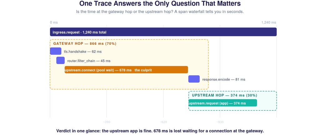
Walk the path. The client connects through an edge load balancer that terminates TLS — and a cold connection pays for a full handshake, which spikes tail latency precisely when traffic surges and new connections are being established. The request enters the gateway (Envoy), passing through the listener and filter chain. Then comes the hop that hides more latency than any other and shows up in almost nobody's mental model: the connection pool. If the pool to the upstream is saturated, the request waits — not computing, not in flight, just queued inside the gateway for a connection to free up. Only then does it reach the upstream pod, do the actual application work, and return through response encoding.
Here's the trap. From the upstream service's point of view, it received the request, processed it in 40 ms, and replied. Its metrics are pristine. The 678 ms the request spent waiting in the gateway's connection pool appears in no application dashboard. It's real, it's customer-facing, and it is structurally invisible unless you measure the gateway hop separately. A single p99 line collapses all of this — TLS, filters, pool-wait, app work, encoding — into one indistinguishable number.
The One Question That Halves Every Triage
Before you debug anything, you want the answer to a single question: is the time being spent at the gateway hop or the upstream hop? That one bit of information eliminates half the suspect list instantly. Gateway-hop dominant points you at TLS, filters, connection pools, retries, and routing. Upstream-hop dominant points you at the application, its dependencies, and its own resource limits. Knowing which half you're in is the difference between a five-minute triage and a fifty-minute one.
Distributed tracing answers this question directly, and a span waterfall makes it visible at a glance.
This is the entire value proposition of tracing the ingress, distilled. The root span is the total request. Child spans break it into TLS handshake, filter chain, the upstream connect (pool wait), the actual upstream request, and response encoding. The moment you see this waterfall, the verdict is obvious: the upstream app did its work in a reasonable time; the request bled hundreds of milliseconds waiting for a connection at the gateway. No log spelunking, no guessing — the structure of the latency is right there in the shape of the bars.
The practical lesson: tracing earns its keep at the ingress not because you'll stare at every trace, but because when p99 moves, a representative slow trace tells you which hop to go fix before you've finished logging in.
Wiring OpenTelemetry Across the Ingress
Getting this picture requires three things to line up, and each is a place teams get it subtly wrong.
Context propagation has to survive the gateway. A trace is only coherent if the trace context (the W3C traceparent header, typically) is generated at or before the edge and propagated through Envoy to the upstream, which must continue rather than restart the trace. If the upstream starts a new trace, you get two disconnected halves and lose the very gateway-vs-upstream comparison you came for. Configure Envoy to participate in tracing and ensure your services honor incoming context.
Envoy's own spans need to be meaningful. Envoy can emit spans for the connection lifecycle, upstream requests, and retries. The default span set is often too coarse — you want the upstream-connect duration broken out, because pool-wait latency is the single highest-value thing you're hunting. Tag spans with the cluster, the upstream host, the response flags, and whether a retry occurred. Those tags are what let you slice a pile of traces by "show me the slow ones where a retry happened."
Sample for the tail, not the average. Head-based sampling at 1% will, by construction, mostly capture the fast common case and miss the rare slow requests that are the entire problem. For latency work, tail-based sampling — decide whether to keep a trace after you know its duration — is dramatically more useful, because it lets you retain the slow traces and discard the boring fast ones. If tail-based sampling isn't available, at minimum bias sampling toward error responses and high-latency requests.
Get these three right and you've converted "p99 is up" from a mystery into a query: pull recent traces over your SLO, look at the waterfall shape, read the dominant hop.
The Envoy Stats That Predict the Cliff
Tracing tells you where the time went after a request is slow. But tail latency is a lagging indicator — by the time p99 visibly moves, the system has often been degrading for a minute or more. The leading indicators live in Envoy's stats, and watching them is how you get ahead of the cliff instead of chasing it.
Four counters carry most of the predictive signal. upstream_cx_pool_overflow fires when requests can't get a connection and must queue — the earliest sign that pool-wait latency (the culprit from our trace) is building. upstream_rq_pending_active is the depth of that pending queue; its slope matters more than its absolute value, because a steadily rising queue is backpressure accumulating. upstream_rq_retry and retry_overflow reveal retry pressure — and retries are insidious because they inflate effective load on an already-struggling upstream, the exact moment it can least absorb it. outlier_detection.ejections_active shows hosts being ejected, which shrinks the available pool and concentrates load on the survivors — a feedback loop that drives straight into the tail.
The pattern these trace together is a causal chain: pool-wait begins, the pending queue grows, retries amplify the load, unhealthy hosts get ejected, the survivors saturate, and then p99 cliffs. If you alert on the tail, you're alerting on the last link. If you alert on pool overflow and pending-queue slope, you're alerting on the first — with a minute or more of lead time to shift traffic, scale out, or shed load before customers feel it.
Why Naive Retries Turn a Slowdown Into an Outage
Retries deserve special attention because they're the mechanism by which a partial degradation becomes a total one — and because they hide inside your tail latency in a way that's easy to miss.
When an upstream slows down, requests start timing out. A naive retry policy responds by sending those requests again, which means a degraded upstream that was handling N requests per second is suddenly handling N plus all the retries — at the precise moment it has the least capacity to spare. The slowdown deepens, more requests time out, more retries fire, and you've built a feedback loop that converts "the upstream is 20% slow" into "the upstream is down." Worse, from the client's perspective, a request that succeeded on its third attempt still took three timeouts' worth of time — so the retries are in your tail latency, inflating p99 while the per-attempt metrics look fine.
This is why Envoy's retry budgets exist: they cap retries as a fraction of active requests, so retrying can't itself become the load that finishes off the upstream. The observability lesson is to make retries visible — tag traced spans with retry attempts, watch retry_overflow, and when you see tail latency that doesn't match per-attempt upstream latency, suspect retries amplifying the tail. An auto-scaling or remediation system that responds to elevated latency by loosening timeouts or retries is pouring fuel on this fire with perfect confidence.
Read the Tail, Not the Average
All of this depends on measuring latency correctly in the first place, and the most common mistake is upstream of any tracing: averaging.
Request latency is not normally distributed — it's heavily right-skewed, with a long tail of slow requests. Averaging that distribution is actively misleading: the mean gets dragged rightward by the tail yet still sits nowhere near the requests that actually hurt. In the figure, the median is 180 ms, the mean 240 ms, p99 is 1,200 ms, and p99.9 is 4,800 ms. A dashboard showing "average latency: 240 ms" is technically true and operationally a lie, because it renders the 4.8-second requests invisible.
And those tail requests are not a rounding error. At 50,000 requests per second, the worst 0.1% is fifty requests every second — often your highest-value sessions, and exactly the ones a frustrated user will retry, adding to the herd. So: track histograms and high percentiles (p99, p99.9), never the average. Use exponential-bucket histograms so percentiles stay accurate under load.
One subtle trap worth naming: coordinated omission. Many load generators and some metrics pipelines only measure requests they actually sent, and when the system stalls they stop sending — so the very slowest periods are under-sampled, and your measured p99 is rosier than reality. If your latency looks suspiciously stable during a known-bad window, suspect coordinated omission before you trust the number.
An Instrumentation Checklist
If you take one thing from this into your own ingress, make it this set of concrete moves:
Propagate W3C trace context from the edge through Envoy to the upstream, and verify the upstream continues the trace rather than starting a new one. Break out the upstream-connect span so pool-wait latency is measured separately from application time. Tag ingress spans with cluster, upstream host, response flags, and retry count. Use tail-based sampling, or at minimum bias sampling toward slow and errored requests. Alert on upstream_cx_pool_overflow and the slope of upstream_rq_pending_active, not just on p99. Make retries visible in traces and watch retry_overflow. Track latency as histograms with p99/p99.9, never as averages. And test for coordinated omission in your measurement path.
The Milliseconds Are Always Somewhere
A p99 number is the end of a question, not the answer to one. The milliseconds didn't vanish — they accumulated in a specific hop, usually one upstream of where the work happens and invisible to the service that looks guilty. The job of ingress observability is to make that accumulation legible: to decompose the request so a single trace names the slow hop, and to surface the leading indicators so you see the cliff coming instead of falling off it.
Instrument the path so the answer is already waiting. Then "p99 is up" stops being a 3 a.m. mystery and becomes a query you can answer before you've finished your coffee.
If you work on ingress performance, distributed tracing, or payments-grade reliability, I'd like to compare notes — find me on LinkedIn or drop a comment below.